KENDRICK
HALIM
EMAIL: kendrickhalim62@gmail.com
UI/UX Portfolio
Kendrick Halim

KENDRICK HALIM

UI/UX DESIGNER

About Me

Hi, I'm Kendrick Halim. I'm a UI/UX designer driven by a passion for problem-solving and critical thinking. To me, UI/UX goes beyond creating visually appealing interfaces. It's about understanding human psychology, analyzing user behavior, and crafting experiences that make people feel comfortable and empowered while using digital products.

SKILL

  • Figma - Advanced
  • UI/UX Design - Intermediate
  • User Research - Intermediate
  • Prototyping - Intermediate
  • HTML/CSS - Basic

EDUCATION

Bachelor of Computer Science

IBBI University

2023 - 2027

TOOLS

Figma
Canva
Photoshop
Adobe XD

GREENNEST

WEBSITE DESIGN

GreenNest Website Mockup

Web Design - Portfolio

GreenNest (E-Commerce)

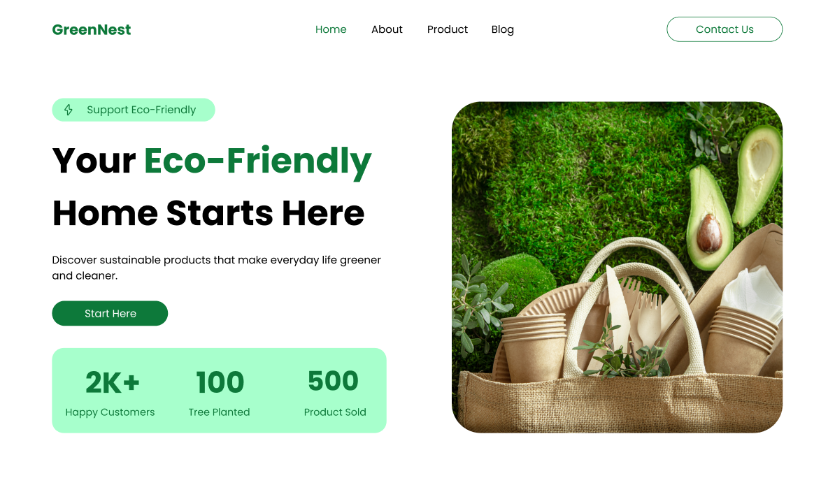
This website is about introducing eco-friendly products to the people who visit this website. In this website, it also sells eco-friendly goods that can be purchased by customers.

The main thing that I concerned myself with was making the design feel visually appealing and ensuring customers can feel comfortable when entering the website. That's why I chose to use green colors, because green is related to the environment, which is suitable for the website I created.

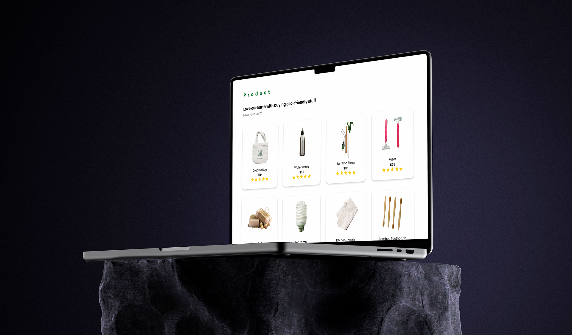
On this website, customers can find things they want to purchase. I designed the UI to be minimalist and clean to make sure they don't feel confused, and this can increase the selling rate for the website.

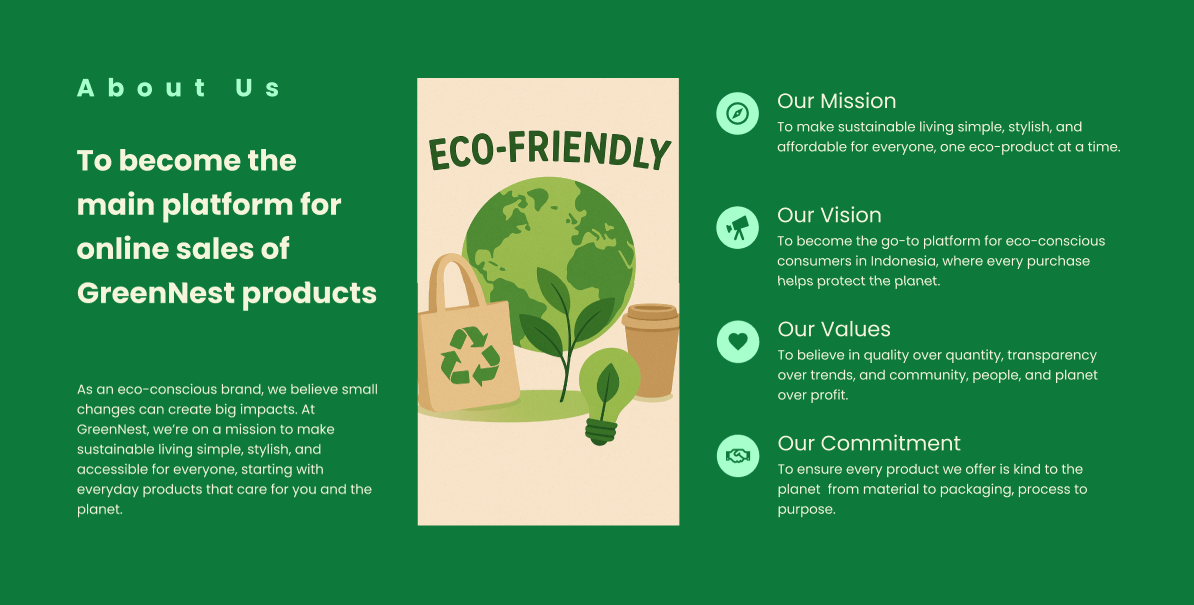
Deliverable: About Us Page (GreenNest)

GreenNest About Us Page Design

DESIGN THINKING

1
Empathize

Understood the target audience's needs and wants to ensure the design fits their preferences. Conducted research to align the solution with user expectations and behaviors.

2
Define

Defined the core challenge: Create a website with a visually appealing layout that provides a seamless user experience. The goal is to make products easy to find, simplify shopping decisions, and build trust in the customers' eyes.

3
Ideate

Studied successful websites to learn about their strengths and weaknesses. Analyzed the differences between existing solutions and my proposed design to find opportunities for improvement.

4
Prototype

Designed high-fidelity UI mockups and established a design system to choose the right colors, fonts, and icons. Created interactive prototypes for usability testing to gather feedback from users and improve the design.

5
Test

Users tested the website prototype to validate the design. I collected feedback from users to identify pain points and iterated on the design for final improvements.

GreenNest Product Page

PROBLEM STATEMENT

Environmentally conscious consumers struggle to identify genuinely sustainable products due to widespread greenwashing. Misleading marketing claims create confusion and distrust, making it difficult for shoppers to make responsible purchasing decisions with confidence.

SOLUTION

To solve this problem, GreenNest provides a curated marketplace with a Transparency Score for every product, making it easy for users to trust and buy sustainable goods quickly. This empowers consumers to confidently identify and purchase genuinely sustainable products, eliminating confusion caused by greenwashing.

TARGET USERS

Demographics:

  • Age: 20-40 years old
  • Income: Middle-class earners
  • Values: Environmentally conscious individuals seeking sustainable product alternatives

Psychographics:

  • Value sustainability and environmental responsibility
  • Appreciate minimalist and modern design aesthetics
  • Active on social media platforms
  • Seek brands that align with their personal values

Behavioral Patterns:

  • Frequent online shoppers who prefer e-commerce platforms
  • Actively seek plastic-free and eco-friendly alternatives for daily use
  • Research-driven consumers who prioritize product sustainability and certifications
  • Influenced by brand transparency and environmental impact

RESEARCH

Survey 50 respondent

78% want eco-friendly products but are constrained by price and access

Interview 8 users

Need a platform that provides complete products + education

Competitor analysis

The majority of eco-friendly websites do not yet provide an impact tracking feature

QUANTITATIVE RESEARCH

Collect data from the users and focuses about user satisfaction

80%

of respondents were aged 20-35 years.

70%

are willing to pay 10-20% more for certified products.

65%

have tried zero-waste living but stopped because products were hard to find.

QUALITATIVE RESEARCH

Understanding user behaviors, experiences through methods like interview, usability testing, observations, documentation

Some of the questions:

  • What type of users are you?
  • What does 'sustainable living' mean to you, and how do you incorporate it into your daily routine?
  • How often do you purchase eco-friendly product in one month?
  • Do you find any difficulty searching for eco-friendly product in your environment?
  • Can you describe a time when you tried to make a more eco-friendly purchase? What was your experience like?

USER PERSONA

Filler Wood

Filler Wood

Sustainable Designer

Age: 24 Years Old

Occupation: Sustainable Designer

Location: Pekanbaru

Tech Savviness: High

Bio

Filler is a 24-year-old designer based in Pekanbaru. He is deeply concerned about environmental and sustainability issues. As a tech-savvy designer, Filler actively seeks out eco-friendly products for his daily needs, especially furniture and home decor made from sustainable materials.

He frequently shops online and prioritizes local products that have high aesthetic value and are environmentally friendly. Filler is also active on social media and often shares inspiration about sustainable living with his followers.

Goals

  • Wants to buy eco-friendly items and find products that are stylish and modern
  • Support local suistanable brands by promoting eco-friendly products

Frustrations

  • Difficulty finding websites/stores that sell eco-friendly products
  • Complicated website flows that cause confusion
  • Lack of product information provided by sales staff in offline stores

Behaviors

  • Frequently searches websites to compare product prices and check certification badges
  • Follows current trends in society on social media
  • Shares product recommendations and sustainable living tips with friends and social media followers

Needs

  • Access to trusted platforms that sell verified eco-friendly products and provide accurate, transparent information
  • High-quality images and styling inspiration showing how products look in real spaces before purchasing
  • Educational content and news about environmental impact and how choosing eco-friendly products contributes to sustainability

DESIGN SYSTEM

Color

#00793A Primary Color
#A7F1CC Secondary Color

Typography

Poppins - Normal

Poppins - Bold

Icons

Money Icon Check Icon Rocket Icon Heart Icon Eye Icon

Components

BUSINESS IMPACT & METRICS

85%+ Task Success Rate
Projected increase in successful product discovery and purchase completion through intuitive navigation and verified product filtering.
40% Faster Product Search
Estimated reduction in time-to-find sustainable products, directly addressing the 65% of users who stopped eco-living due to difficulty finding products.
90% Purchase Confidence
Expected user confidence level when identifying genuine eco-friendly products through transparency badges and verified certifications.

PODCAST
APP

MOBILE DESIGN

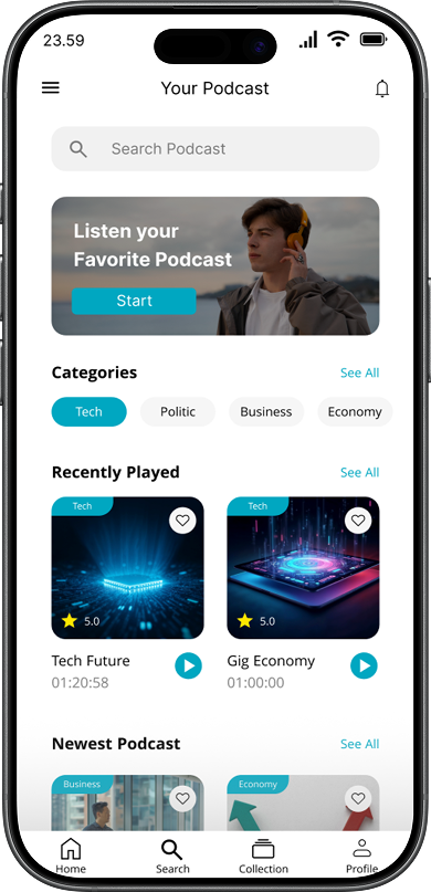
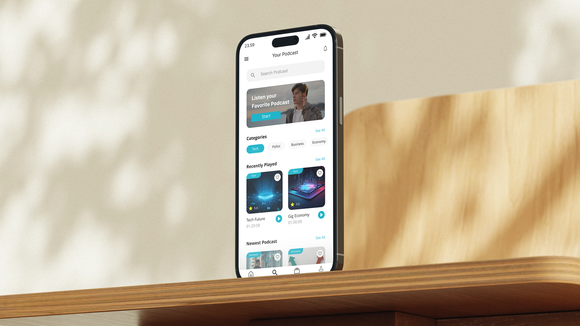
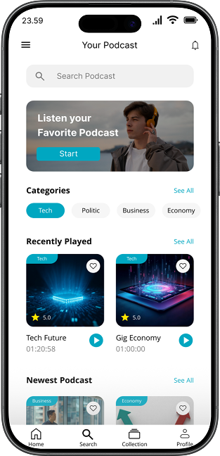
Podcast App Main Screen

ABOUT THIS APPLICATION

Podcast application is an application I make for them who want to hear podcast and listening experience for audio enthusiasts. Many users struggle with cluttered interfaces and difficulty discovering content that matches their interests. I have made this podcast based on category, so that users can't feel confused of choosing which topic they want to hear. This app aims to solve that by providing a personalized and intuitive platform for seamless audio consumption.

The design focuses on minimalism design without so many colors and ease of use, ensuring that navigation feels natural across all screen and also can improve user experience. I create a clean player interface and organized content hierarchy so users can play it without distractions. The goal is to make every listening session enjoyable and hassle-free, allowing users to focus on the content rather than the interface.

Podcast App Screen 1

PROBLEM

Podcast listeners wants to hear podcasting session. But they are struggling to choose the right platform that matches their interests. Complex navigation and unnecessary features create friction, making users feel hesitant to continue their listening sessions.

Problem Illustration
Solution Illustration

SOLUTION

To solve their frustrations, I am making an application which is ensure user satisfaction and want to make them happy when they entering my app. By prioritizing essential controls and personalized recommendations, the design reduces cognitive load and allows users to focus on listening without distractions.

GOALS
  • Simplify Navigation: Create an intuitive structure so users can find and play episodes with minimal clicks.
  • Enhance Discoverability: Improve content recommendation features to help users find podcasts matching their interests.
  • Immerse Listening Experience: Design a clean player interface that minimizes distractions during playback.
  • Increase Engagement: Encourage consistent usage through personalized libraries and easy access to favorites.
Portfolio Kendrick Halim Portfolio Kendrick Halim
Podcast App Mockup
Portfolio Kendrick Halim Portfolio Kendrick Halim

USER INSIGHTS
Michael

Michael

I often give up searching for a new podcast because there are too many options. The overwhelming choices make me feel frustrated and unsure what to select. I hope to make the design can be more accessible by user and easy to navigate.

Designer

Designer

Could you describe a bit about yourself and what type of listeners are you?

Michael

Michael

I am Young Professional. My age is about 20 -25 years old. I like to listen podcast about business and I hope to make the designs user-friendly.

USER PERSONA

Michelle Tan

Name: Michelle Tan

Location: Jakarta, Indonesia

Age: 24 Years Old

Tech Savviness: High

Occupation: Young Professional

Bio:

Michelle is a busy marketing executive who listens to podcasts during her commute. She loves learning new things but often feels overwhelmed by too many choices on existing apps. She values simplicity and wants to resume listening quickly without navigating through complex menus.

Goals

  • Find new interesting podcast quickly
  • Resume playback from where she left off easily
  • Enjoy a distraction-free listening experience

Frustrations

  • Overwhelmed by too many recommendations
  • Hard to find the 'History' or 'Resume' button
  • Cluttered interface with unnecessary features

Behaviors

  • Like to see podcast with episodes
  • Prefers application with visually-appealing and easy to use
  • Love to see some type of podcast in the application

Needs

  • Simple and clean navigation with 2 clicks to the purpose
  • Can see the dashboard and check the screen times
  • Features that can adjust the audio speed of the podcast

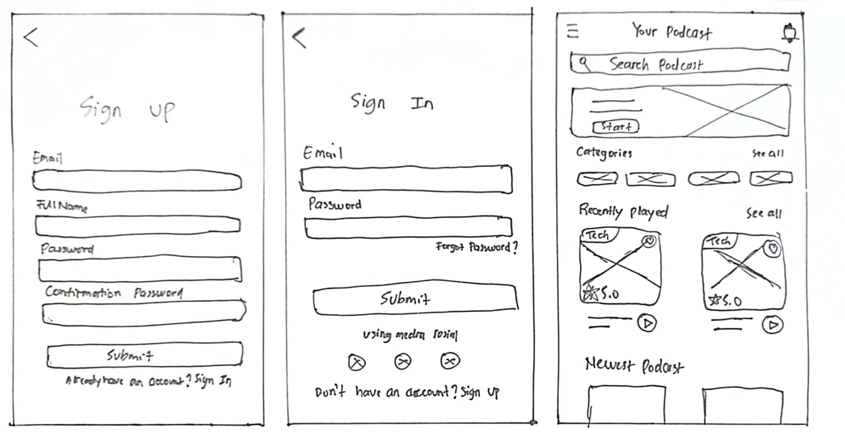
WIREFRAME

Podcast App Wireframes

DESIGN SYSTEM

Color

#00A7C1 Primary Color
#F0F0F0 Secondary Color

Typography

Khula - Normal

Khula - Bold

Khula - Italic

Cards

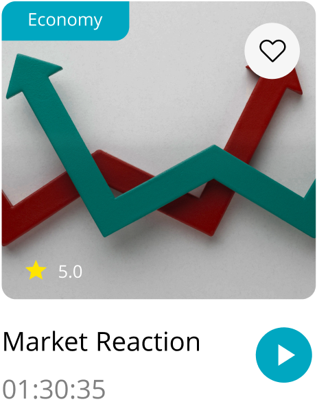
Market Reaction Card

Icons

Money Icon Check Icon Rocket Icon Heart Icon Eye Icon Rocket Icon Heart Icon Eye Icon Rocket Icon Heart Icon

Components

Button - Primary

Button - Secondary

Input Field

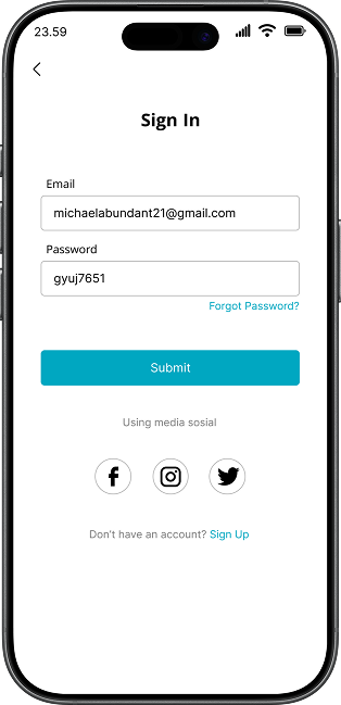
MOCKUP

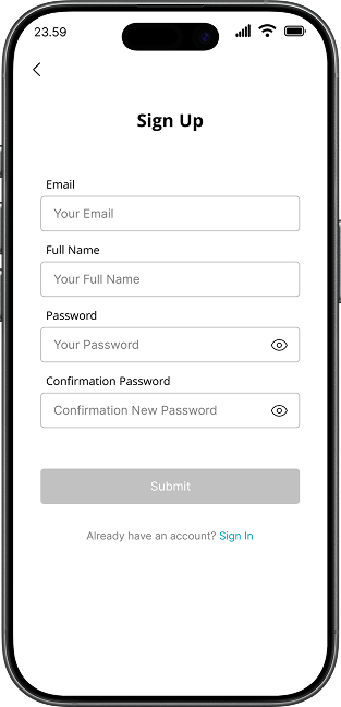
Sign Up Screen
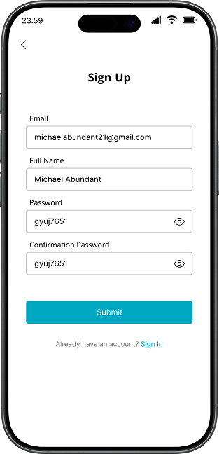
Sign Up Filled Screen
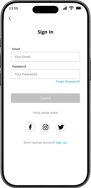
Sign In Screen
Sign In Filled Screen
Home Screen
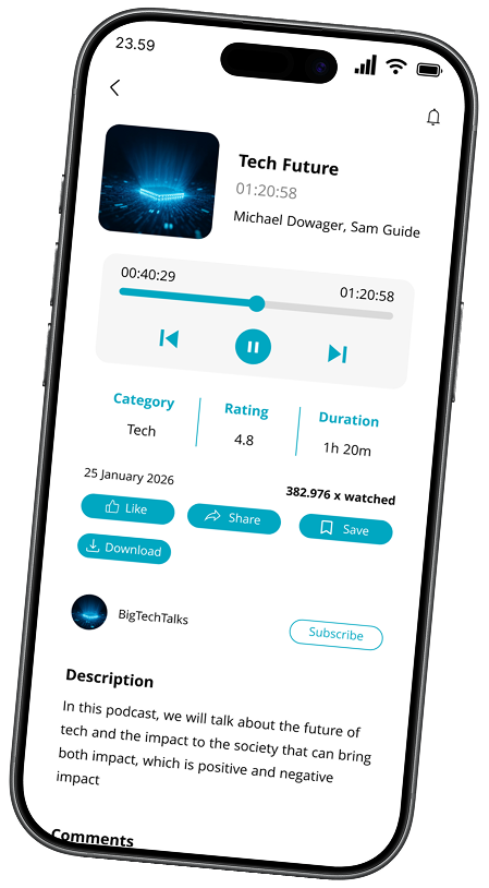
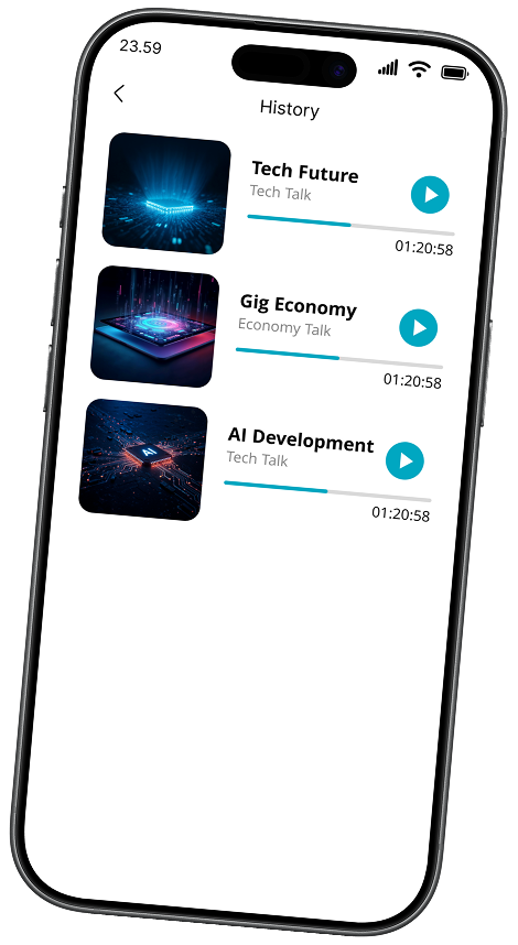
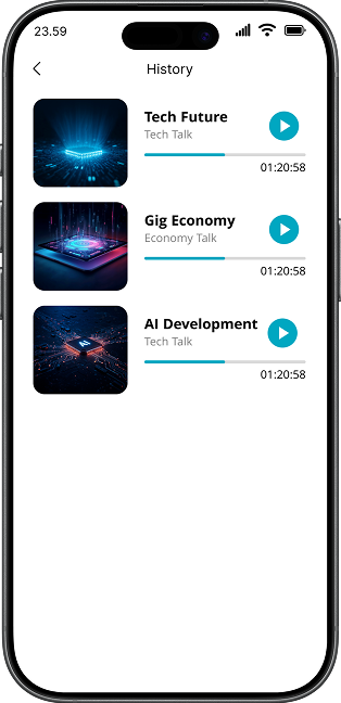
History Screen

RESULT

User now can find podcast more comfortable than before

Users can easily click on the podcast of their choice

Add the category name to the top left of the card so that users don't feel confused.

Integrated personalized recommendations increased user engagement with 'Other Podcast You May Like' section

The new interactive features (Like, Share, Save, Download) provide more ways for users to engage with content

RENTAL
APP

MOBILE DESIGN

Rental App Main Screen
Rental App Detail Screen

ABOUT THIS APPLICATION

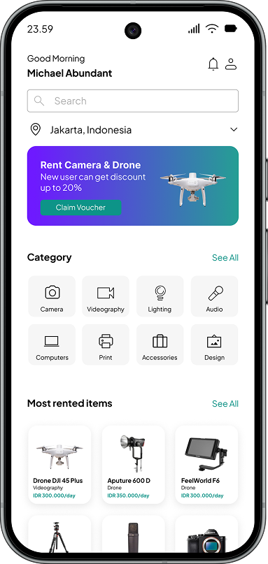
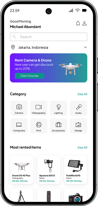
RentGear is a peer-to-peer app that lets people rent out or borrow creative equipment from cameras and lighting to laptops and design tools. It connects local owners with renters who need gear for projects, events, or trials without the cost of buying.

Users browse by category (Camera, Videography, Audio, etc.), filter by location/price, and book securely in app. Owners list their items, set availability, and earn extra income. All through a simple, trusted interface.

Designed for speed and clarity, RentGear reduces friction in rentals with verified profiles, instant booking, and clear terms. It turns gear into opportunity and helps creators get what they need, fast.

Problem Illustration

PROBLEM STATEMENT

Young professionals often need high-quality video equipment to produce crucial work content, but they struggle to afford purchasing these expensive tools outright. This financial barrier limits their ability to create professional-grade videos, hindering their career growth.

Solution Illustration

SOLUTION

RentGear is a peer-to-peer equipment rental platform that connects young professionals and students with local owners of cameras, lightings, audios, and other creative tools. Instead of buying expensive gear, users can rent it affordably for short-term projects all through a simple, trusted mobile app.

GOALS

To create a trusted peer-to-peer marketplace that bridges the gap between equipment owners and young professionals, making high-end filming gear accessible without the high cost of ownership.

Photographer with Camera

TARGET USERS

1 Young professional & freelancers
2 Professional photographers with limited budget
3 High school student for their personal project
4 Small event organizers
5 Tech enthusiasts & Early adopters

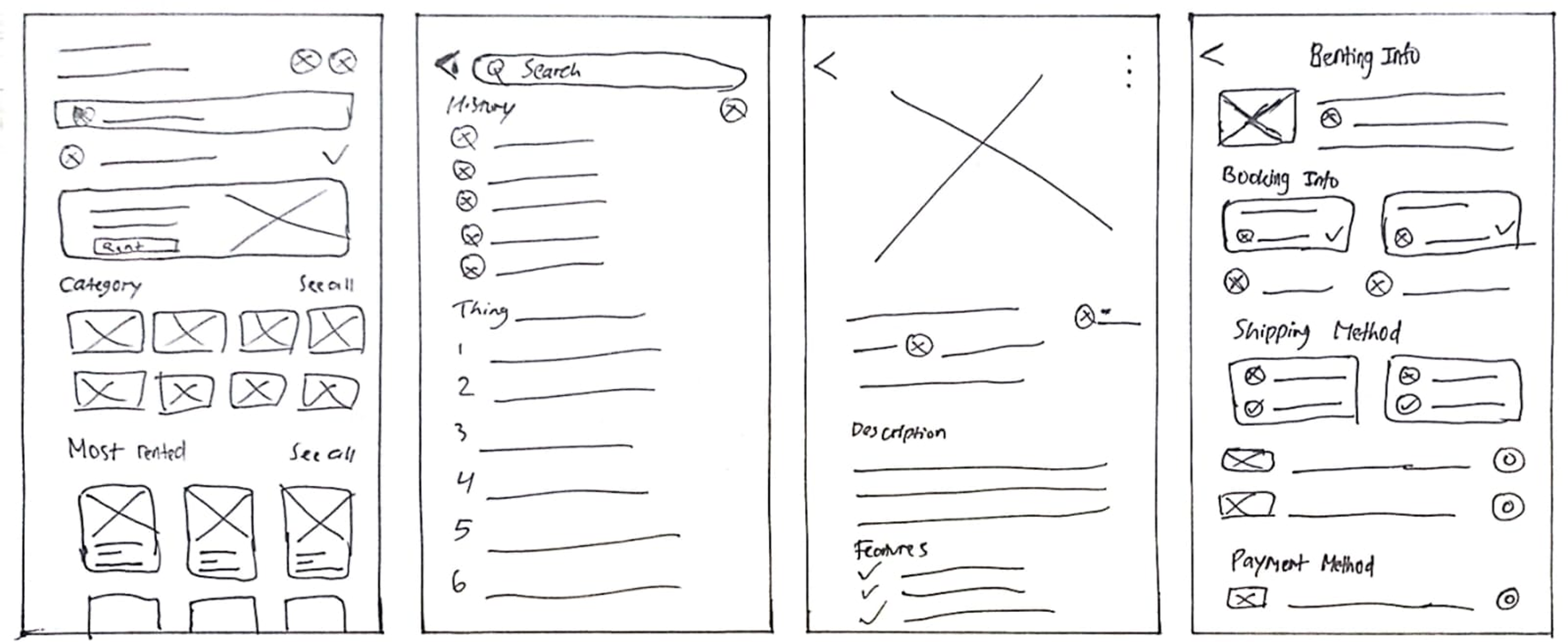
WIREFRAME

Podcast App Wireframes

USER FLOW

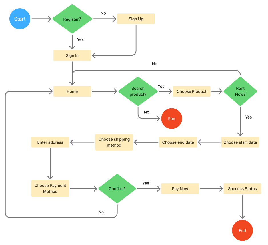
Rental App User Flow Diagram
Portfolio Kendrick Halim Portfolio Kendrick Halim
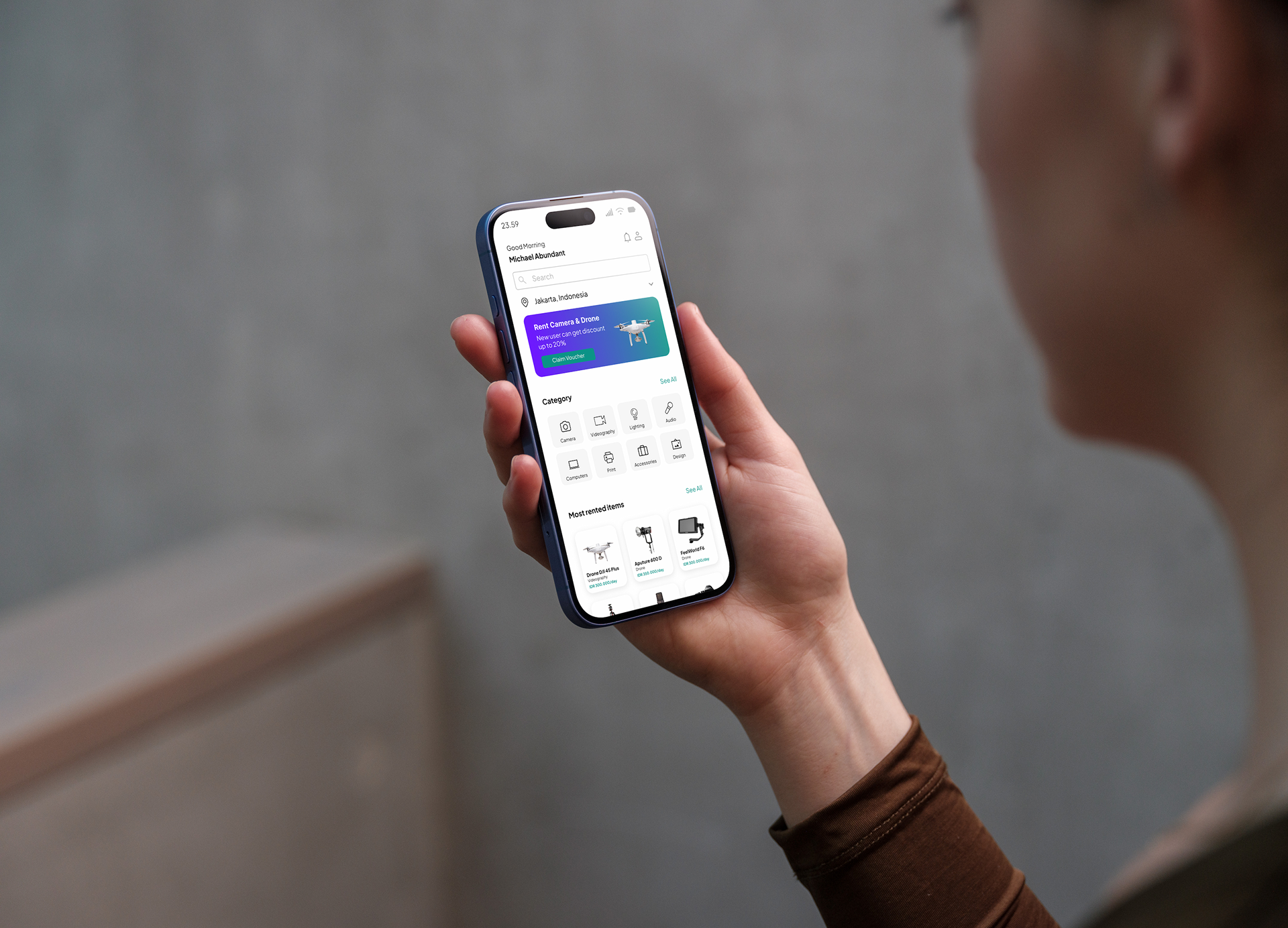
Person Holding Phone - Rental App
Portfolio Kendrick Halim Portfolio Kendrick Halim

USER PERSONA

Michael Parker

Name: Michael Parker

Location: Medan, Indonesia

Age: 21 Years Old

Tech Savviness: High

Occupation: Photographer

Bio:

Michael is a passionate freelance photographer who recently started taking on client projects. He loves creating high-quality content but struggles with the high cost of camera equipment. He often has to turn down jobs because he doesn't own specific lenses or lighting gear required for professional shoots.

Goals

  • Access professional-grade cameras and lenses without buying them
  • Prefers application with visually-appealing and easy to use
  • Find affordable rental options located nearby to save on shipping/time

Frustrations

  • Camera equipment is too expensive to purchase outright as a beginner
  • Traditional rental shops require large deposits and have complicated paperwork
  • Worried about renting from unverified strangers online (fear of scams/damaged gear)

Behaviors

  • Frequently watches gear reviews on video platforms before projects
  • Often borrows equipment from friends but feels guilty asking too often
  • Actively searches for discount codes or budget alternatives for gear

Needs

  • A trusted platform with verified equipment owners
  • Affordable rental rates suitable for a limited budget
  • Easy booking process with clear rental terms and insurance options
Jason Woods

Name: Jason Woods

Location: Padang, Indonesia

Age: 18 Years Old

Tech Savviness: High

Occupation: High School Student

Bio:

Jason is a passionate student filmmaker based in Padang. He frequently works on school projects and personal videos that require professional gear, but buying equipment is beyond his student budget. He looks for affordable rental options but worries about receiving damaged gear that could ruin his work.

Goals

  • Complete academic and personal projects using professional-grade equipment
  • Achieve higher grades by producing high-quality video content
  • Deliver professional, clear results without the burden of ownership

Frustrations

  • Professional equipment is too expensive to purchase on a student budget
  • Difficulty finding trustworthy owners; concerned about scams or receiving damaged gear
  • Friends are unwilling to lend expensive equipment for free due to risk of damage

Behaviors

  • Often rents multiple items simultaneously (e.g., camera, lens, and mic) for a single project
  • Prefers accessing the latest equipment models to ensure high-quality output
  • Values owners who respond quickly to inquiries and maintain well-kept gear

Needs

  • Cost-effective rental options within a student budget
  • Clear communication and transparent rental terms
  • Assurance of equipment quality and functionality before booking

DESIGN SYSTEM

Color

#0D9488 Primary Color
#7C3AED Secondary Color
#EFEFEF Third Color

Typography

Plus Jakarta Sans - Normal

Plus Jakarta Sans - Bold

Plus Jakarta Sans - Italic

Icons

Money Icon Check Icon Rocket Icon Heart Icon Eye Icon Rocket Icon Heart Icon Eye Icon Rocket Icon Heart Icon

Components

Button - Primary

Button - Secondary

Input Field

UX Decision

1

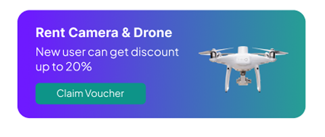
Claim Voucher Button

Claim Voucher UI Banner

Challenge

High equipment costs create a barrier for students and freelancers with limited budgets. They often hesitate to book without financial incentives or discounts.

Decision

Introduced a prominent 'Claim Voucher' banner on the homepage offering up to 20% off for new users.

Why

This lowers the entry barrier, making professional gear more accessible for budget-conscious users. It incentivizes the first booking and encourages retention by providing immediate value.

2

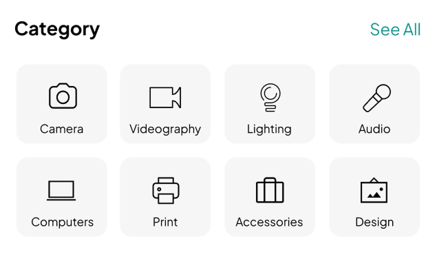
Category

Challenge

Users often browse exploratorily and get overwhelmed by long text-heavy lists. They need to find specific equipment types (e.g., Lighting vs. Camera) quickly without reading every item.

Decision

Designed a visual grid system with distinct icons for each category and a 'See All' link for overflow content.

Why

Visual icons are processed faster by the brain than text. This reduces cognitive load, allowing users to scan and navigate to their needed gear instantly, making the browsing experience feel effortless and intuitive.

Category Grid UI

MOCKUP

Home Screen
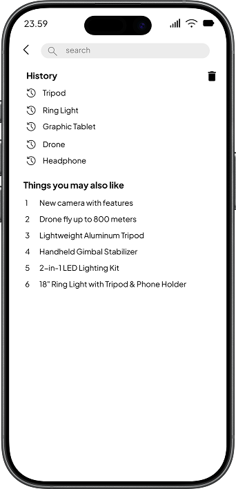
History/Profile Screen
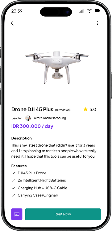
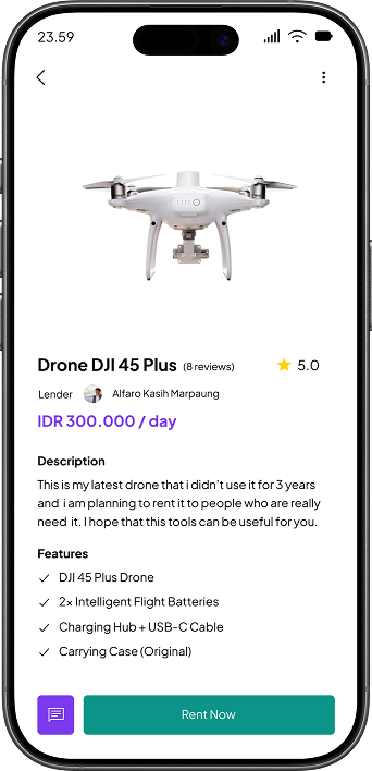
Product Detail Screen
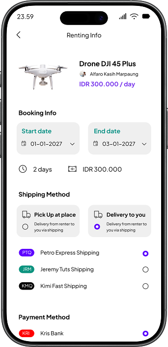
Booking Screen

RESULT

  • Users can choose the items they want to rent based on the category in the homepage
  • Achieved an 85% satisfaction score in post-test surveys regarding the clarity of the pricing summary
  • Simplified the rental process from selection to payment, reducing user friction during checkout
  • Clear display of insurance and payment options reduced cart abandonment rates in usability testing
  • Categorized navigation helps users find specific equipment 2x faster than the previous version

Learning & Growth

This project deepened my understanding of rental business models and user decision-making patterns. I learned how to design trust-building elements into the interface and apply psychological principles like scarcity and social proof to improve user engagement.